
123FormBuilder Homepage Redesign & A Big Shift From B2C to B2B
Overview
123FormBuilder was undergoing a positioning shift: moving from a general consumer-focused audience to a more enterprise-oriented B2B market. The existing homepage was visually outdated, text-heavy, and failed to communicate the value of the product to decision-makers evaluating enterprise tools.

My Role
Marketing team designer leading the homepage redesign, collaborating closely with the product and development teams to plan, design, and implement the new experience.

Scope
UX exploration, visual design, component refinement, illustration direction, and integration of Lottie animations.

Tools
Figma, WordPress
The Challenge
The old homepage was heavily B2C-oriented, focusing on simple form creation instead of the enterprise use cases, integrations, compliance, and workflows the company needed to highlight. Its visuals felt outdated and uneven spacing across sections made the layout feel unbalanced and less polished. The social proof area was not prominent enough to build credibility for enterprise buyers, and key functionality was difficult to discover because the features content was not visible or structured in a meaningful way. In addition, the layout was built on legacy components that made updates difficult and limited consistency across pages.
Business Goal
The core business goal was to reposition the brand toward enterprise audiences while modernizing the visual identity and improving clarity, trust, and conversion.
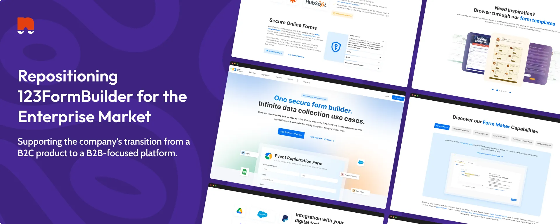
Homepage hero before and after the redesign
Redesign Goals
I worked with marketing and product leadership to define four core objectives:

Communicate enterprise value
Shift the messaging from “easy form builder” to “secure, scalable data collection platform.”

Strengthen brand consistency
Use the updated design system, modernized typography, and refreshed illustrations.

Improve structure and flow
Guide users through benefits, features, social proof, and CTAs in a logical, conversion-driven layout.

Introduce motion for clarity
Use subtle Lottie animations to explain how the product works without overwhelming the page.
Design Process
A focused, collaborative process aimed at clarifying the product’s value and supporting 123FormBuilder’s transition toward enterprise users.

I reviewed the existing homepage to evaluate how the product was being presented, where the messaging fell short for enterprise audiences, and how effectively key features and trust signals were surfaced. This helped identify gaps in hierarchy, clarity, and feature discoverability.
Key activities:
- Audited homepage structure, messaging, and visual hierarchy
- Identified areas where enterprise value was not clearly communicated
- Assessed feature discoverability and trust signals

Based on the initial findings, I worked with marketing and product stakeholders to clarify the homepage’s role within the company’s broader B2B strategy and align on what success looked like.
Key outcomes:
- Clear agreement on the homepage’s purpose and audience
- Defined priority messaging around security, integrations, and scalability
- Established success criteria for clarity, trust, and conversion

I explored multiple content structures and layouts, focusing on how enterprise buyers typically evaluate tools and make decisions. The goal was to surface value earlier and improve overall flow.
Key considerations:
- Reordering content to highlight value and product capabilities sooner
- Grouping features into clear, enterprise-relevant pillars
- Designing a logical path from introduction to conversion

Using the updated design system, I created high-fidelity designs for the full responsive homepage. The visual language was refined to feel more modern, structured, and product-focused.
Key deliverables:
- Desktop and mobile homepage designs in Figma
- Updated spacing, typography, and component usage
- Product-focused illustrations and reusable components

Throughout implementation, I collaborated closely with a developer and ran internal reviews with marketing and product teams to refine the final experience and ensure design fidelity.
Key improvements:
- Iterated on copy hierarchy and CTA placement
- Refined interactions and motion for clarity
- Ensured scalability and maintainability post-launch
The Solution
A modern, enterprise-focused homepage.
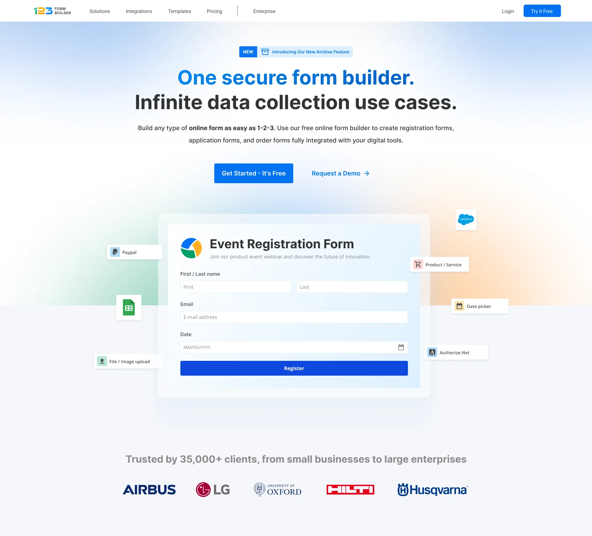
The redesign maintained the existing headline while enhancing the hero section through the introduction of a Lottie-based form animation with a subtle parallax effect. As users scroll, supporting UI elements are progressively introduced around the form, helping illustrate product capabilities in a more engaging and dynamic way. Beyond the hero, the layout was refined to be cleaner and more structured, with stronger emphasis on integrations, security and compliance blocks to build credibility, high-impact testimonials, and a scalable component system designed to support future marketing pages.
From static hero to interactive product preview
The hero section was redesigned to move beyond a static image and better demonstrate how the product works. A Lottie-based animation with a subtle parallax effect was introduced, allowing floating UI elements to respond to scroll and gradually assemble into an event registration form. This interaction helps bridge the gap between marketing and product by giving users an immediate, visual understanding of how forms are built and used within the platform.
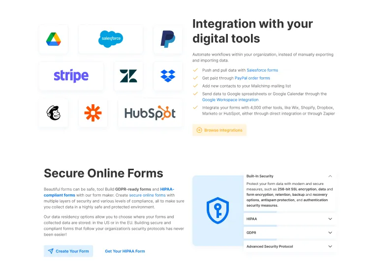
Interactive integrations and security content
Instead of relying on static illustrations, these sections were redesigned as interactive modules. Users can now explore integrations by clicking on individual app logos, each linking to a dedicated landing page that explains how the integration works in detail. The security section was similarly enhanced with an accordion component, allowing users to progressively explore compliance standards and security features without overwhelming the page.
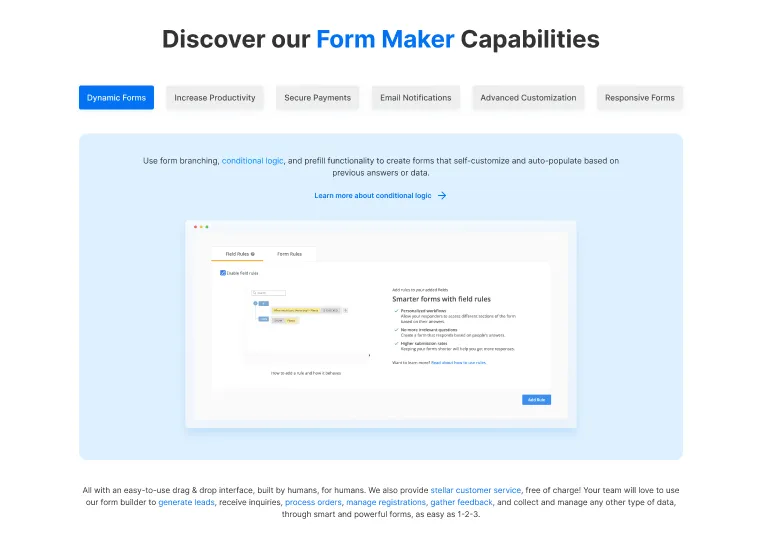
Feature discovery through interactive modules
Instead of presenting features as static icon-and-text columns, this section was redesigned as an interactive module with tabs that allow users to explore each capability in context. Each tab introduces the feature with supporting copy and is paired with a short tutorial video that demonstrates how it works in practice. This approach helps users better understand functionality, reduces ambiguity, and supports product education directly on the homepage.
Impact & Outcomes
While performance metrics varied due to a broader shift in audience and market conditions, the qualitative impact of the redesign was clear across the product and marketing teams.
Stronger enterprise positioning
The homepage successfully supported the company’s shift toward a B2B audience, with clearer emphasis on integrations, security, and advanced use cases across campaigns and landing pages.
Improved brand consistency
The updated design system and visual language aligned the homepage with newer marketing materials, creating a more cohesive and professional brand presence.
Faster and more scalable page production
Design patterns introduced on the homepage were reused across more than 80 marketing and campaign landing pages, reducing design and implementation effort.
Clearer product communication
Interactive modules, motion, and structured content improved how features and capabilities were explained, helping bridge the gap between marketing and product understanding.
Reflection
This project pushed me to think more strategically about brand positioning, work across departments to shape both design and messaging, build reusable systems instead of one-off pages, and balance creativity with conversion-first UX. It reinforced my interest in product-led marketing, design systems, and design that supports business storytelling.