Primary


Forging a brand that respects the wild, and earns its place in it.
Outdoor gear is often built for the moment. Seasonal drops. Style over durability. Short lifecycles.
Ember Cairn explores a different approach.
It begins with a simple idea. A brand shaped by endurance, exploration, and respect for the environments it belongs to.
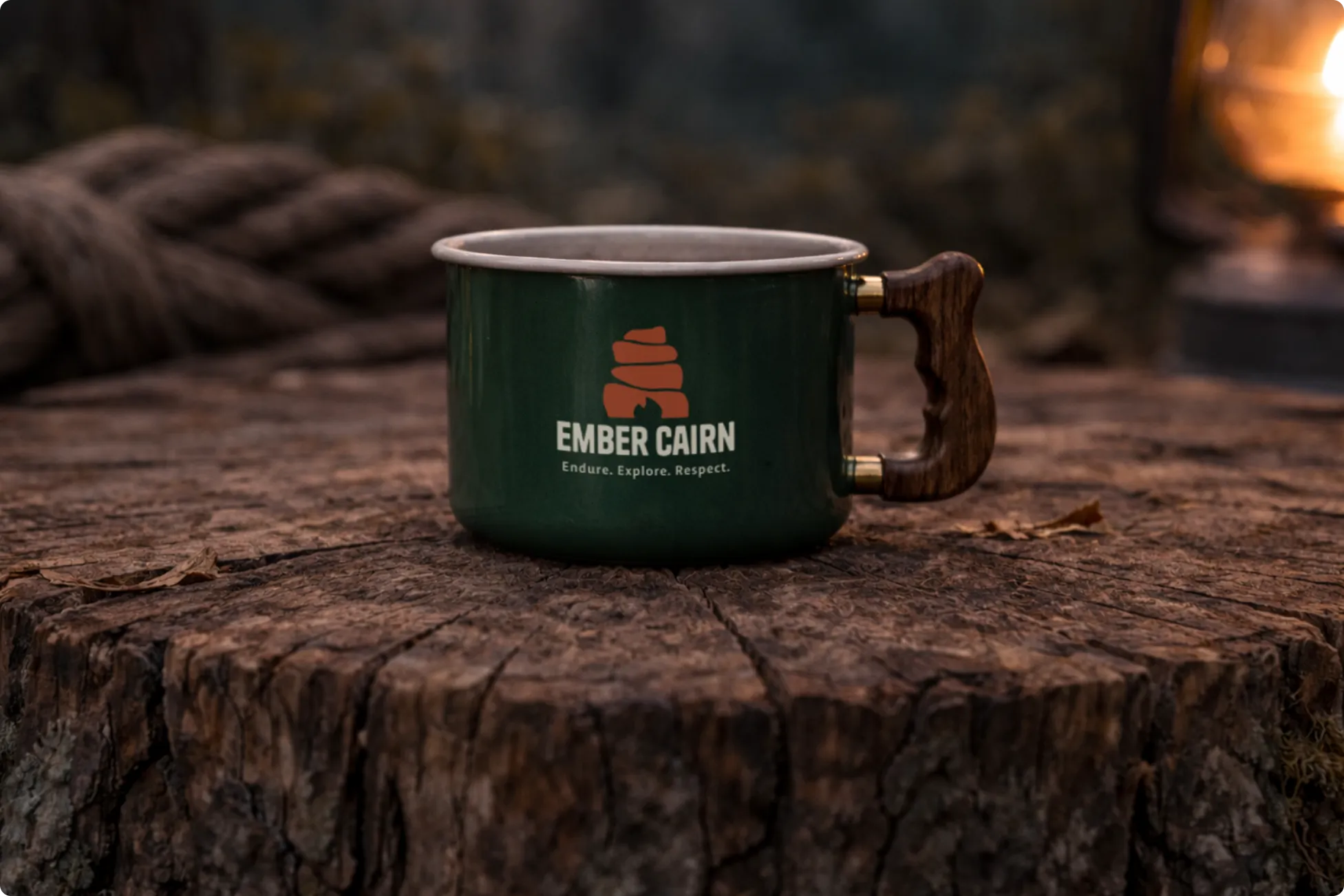
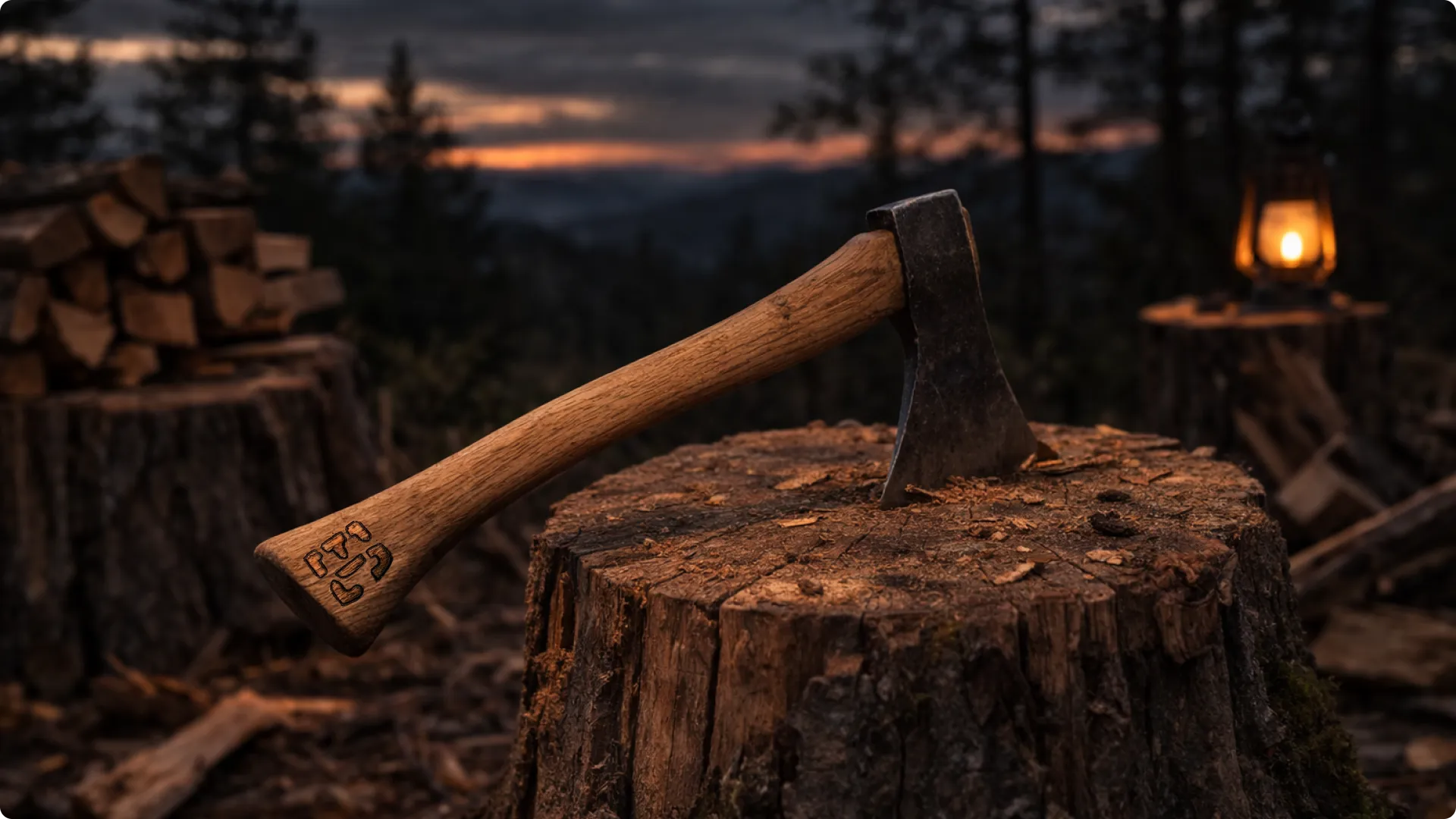
The identity is designed to live across gear, tools, and equipment that age with use rather than fade with time.
Built for the trail.
Built to endure.

A cairn is a trail marker.
Stacked stones placed by those who walked the path before. A quiet signal that the way forward exists.
Ember Cairn builds on that idea.
It's a brand rooted in guidance, endurance, and respect for the terrain.
Simple forms. Honest tools.
Built for those who walk the trail with respect.
A mark designed to remain clear across gear, tools, and environments.
One symbol. Many paths.




Inspired by the environments Ember Cairn belongs to.
Deep forest greens, ember reds, and warm earth tones reflect the terrain, firelight, and materials found on the trail.
The palette balances visibility, durability, and warmth across gear, tools, and environments.
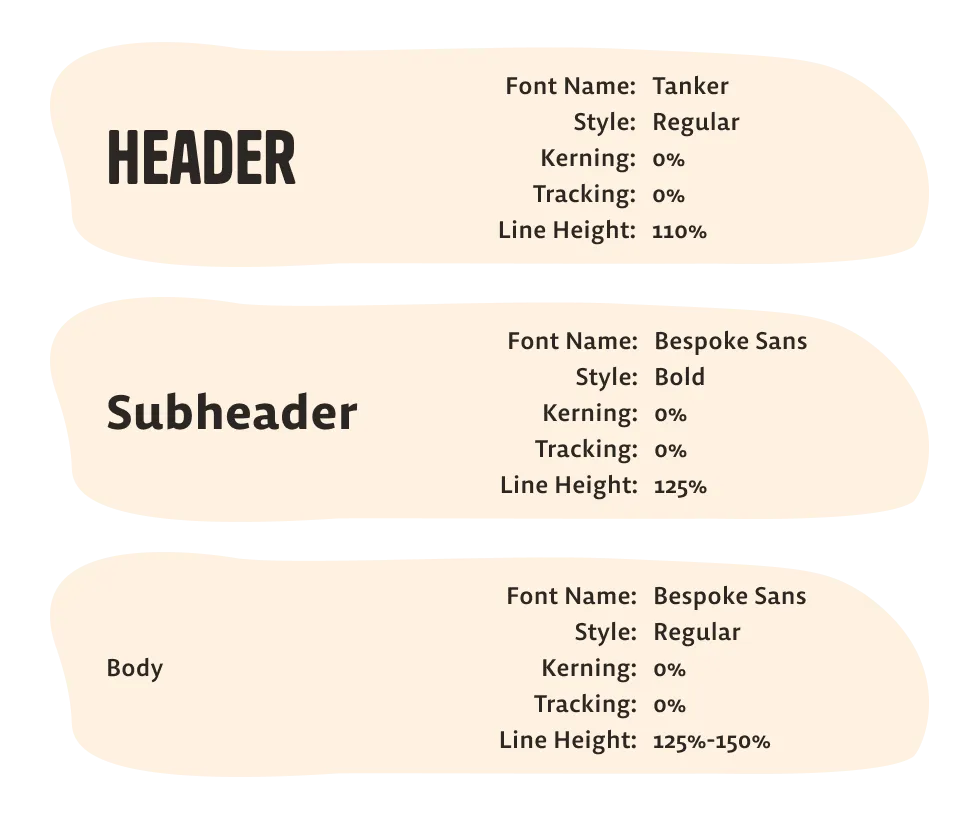
Built to feel steady and dependable.
Tanker gives the brand a bold, grounded voice, while Bespoke Sans keeps longer text clear and easy to read across every application.
Bold where it matters. Clear where it counts.
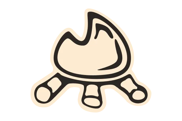
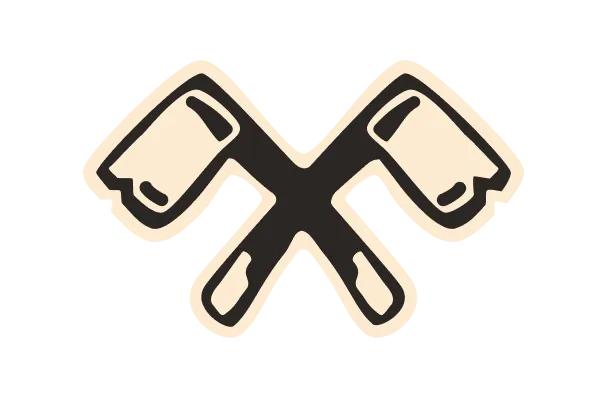
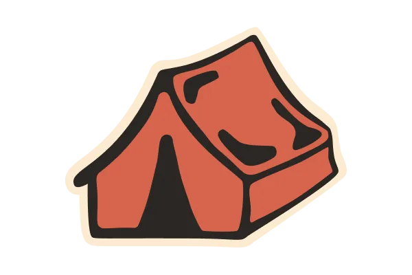
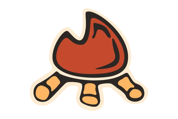
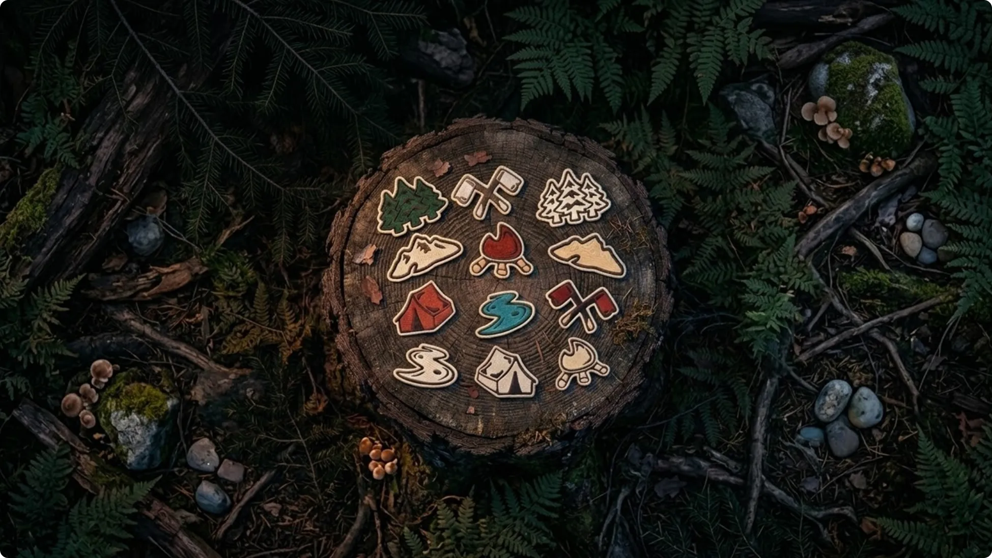
A set of simple symbols inspired by camp life and the trail.
The icons expand the visual language of the brand and can be used in monochrome or brand colors depending on the application.







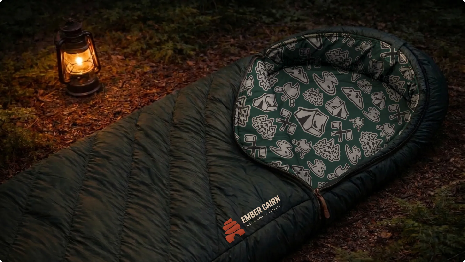
Derived from the icon system, the pattern extends the brand language across surfaces and materials.
It brings subtle detail to packaging, gear, and supporting graphics.



From positioning to visual execution, explore the complete Ember Cairn brand guidelines.
Strategy, identity, color, typography, and applications built to carry the brand across gear, tools, and the trail.
View Brand Guidelines