Horizontal



A handcrafted brand identity for a cozy indie game studio inspired by exploration, creativity, and whimsical worlds.
Lantern Grove Studio is a fictional indie game studio created as a self-initiated branding project.
The goal was to build a distinctive visual identity that captures the warmth, creativity, and sense of discovery found in cozy simulation games while showcasing my approach to brand strategy, identity design, and visual storytelling.
Note: To help communicate the personality of the brand, I created a series of atmospheric background illustrations depicting forests, treehouses, workshops, and cozy environments. These visuals were generated with AI using prompts based on the established creative direction, then carefully selected, refined, and integrated into the presentation to maintain a consistent visual language.
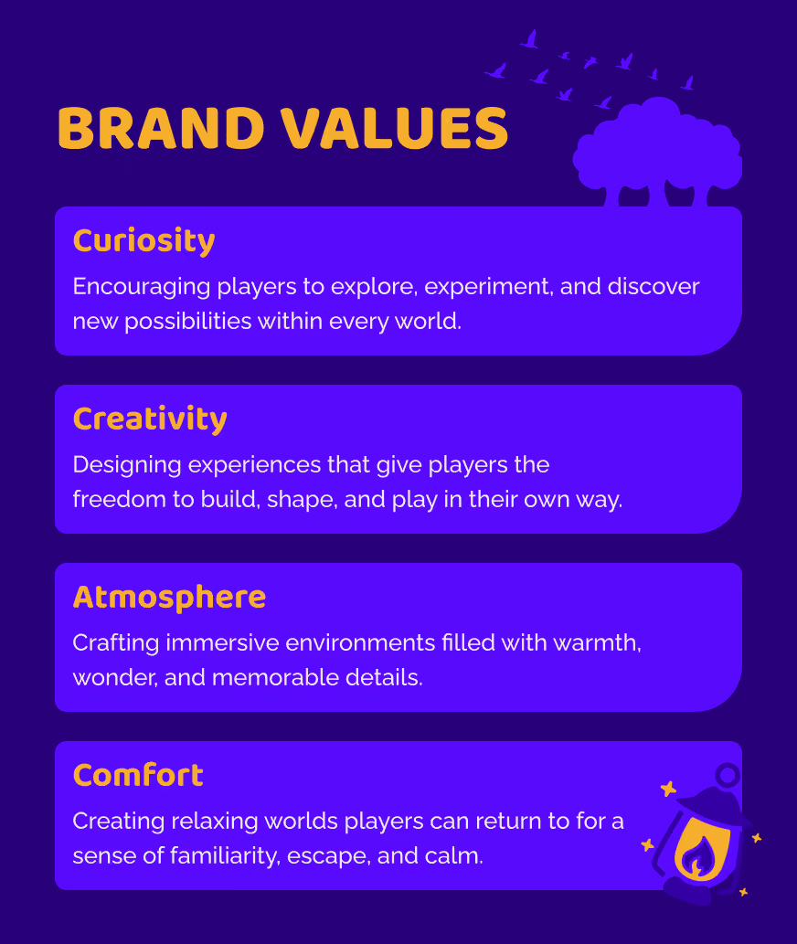
Lantern Grove Studio is built around the belief that games should inspire curiosity, creativity, and a sense of comfort. Its focus is on creating cozy simulation experiences where players can explore, build, and discover at their own pace in thoughtfully crafted worlds.
The brand embraces warmth, craftsmanship, and imagination, reflecting a design philosophy that values memorable details over complexity. Every decision, from the visual identity to the tone of voice, reinforces a welcoming studio dedicated to creating experiences that feel both timeless and inviting.
Every branding project begins with exploration. I used word mapping to uncover the ideas and emotions that define Lantern Grove Studio, connecting themes like nature, fantasy, creativity, exploration, and community into a clear creative direction.
These early exercises established the visual language for the project, ensuring that each design decision was rooted in the brand's personality rather than aesthetics alone.

A cohesive logo system created to perform across print, digital, social media, and in-game assets.


Inspired by moonlit forests, glowing lanterns, and the warmth of handcrafted worlds, the palette balances mystery and warmth through deep twilight purples, a glowing golden accent, and soft neutral tones.
Together they create a visual language that feels imaginative, memorable, and built for exploration.

The typography system pairs Baloo 2 with Raleway to create a balance between personality and functionality.
Baloo 2 brings a playful, handcrafted character that reflects the studio's imaginative spirit, while Raleway provides a clean and modern foundation for for supporting content.
Together, the typefaces create a versatile hierarchy that balances personality with readability, ensuring a consistent voice across every brand touchpoint.
The custom icon set expands the visual identity with nature-inspired symbols that reflect the studio's themes of creativity, exploration, and warmth while maintaining a consistent visual language.
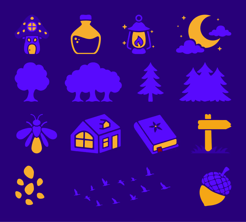
The custom pattern combines icons from the brand system into a playful, repeatable graphic that adds depth, personality, and consistency across print and digital applications.


Want to see how the identity came together? The full presentation walks through the entire branding process, from early strategy and creative exploration to the final logo system and brand applications.
View Brand Presentation
